
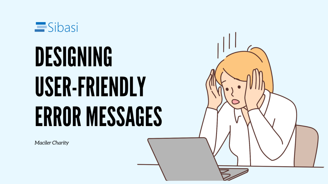
Picture this: you're browsing your favorite online store, excitement building as you add things to your cart, you click "checkout," but instead of a confirmation, a jarring "Payment Error" message flashes on the screen. Your shopping spree hits a snag, and you get massively frustrated. This, my friends, is a roadblock that can transform a smooth online journey into a mess of confusion.
But here's the thing: errors don't have to be like a rogue pop-up ad. By designing effective error messages, we can turn frowns upside down and keep users on their merry way. So, how do we achieve this? Let's dive into the three key principles of user-friendly error messages:
1. High Visibility
It needs to be noticeable, instantly grabbing the user's attention and guiding them towards resolution. Forget hiding messages in tiny corners of the screen; place them close to the source of the error, like a friendly robot pointing out where the malfunction lies. This helps users make the connection: "Ah, this message is about that thing I just did!"
2. Constructive Communication
Ditch the obscure error codes and speak plain English. Use concise, active voice to clearly explain the issue, without blaming the user ("Your password is incorrect," not "Invalid password, try again"). Remember, the goal is to provide clarity, not create confusion.
3. Respecting User Effort
When crafting messages, remember the user's journey. Acknowledge their frustration with a touch of empathy ("We know this is annoying...") and then offer actionable solutions. Don't leave them hanging! Provide clear steps to fix the problem, suggest alternative options, or even offer helpful links to resources. Every little bit of guidance goes a long way in restoring that lost sense of control.
But theory is one thing, practice another. So, let's see how these principles translate into the real world:
Bad message
"Internal Server Error. Please try again later."

This kind of message fails to effectively communicate and guide the user, why?
Why this kind of message fails to communicate effectively and guide the user:
- Technical jargon: "Internal Server Error" throws technical lingo at the user, leaving them confused and uninformed.
- No empathy or explanation: It offers no apology or explanation for the inconvenience, making the user feel unimportant.
- Unhelpful direction: The "try again later" instruction is passive and unhelpful, leaving the user unsure of what to do next.
Good message
"Uh oh, something went wrong on our end! Try refreshing the page, or if that doesn't work, contact our support team for assistance."

This works because:
- Clear and relatable language: We replace technical jargon with simple, descriptive language ("something went wrong"), making the message easier to understand.
- Empathetic and reassuring: We acknowledge the user's frustration and assure them we're working on a solution.
-
Actionable suggestions: We offer two distinct options: trying again later or exploring other sections of the site, giving the user a sense of control over their experience.
Remember, even when your server throws a curveball, user-friendly error messages can help maintain a positive brand experience and keep your customers coming back for more. So, let's turn those internal server errors into opportunities to showcase empathy, transparency, and a touch of creativity!


