
Introduction: When Dashboards Actually Matter
Picture this: It's Monday morning, and your CFO opens a dashboard to review the company's contract portfolio. Within 30 seconds, they know exactly how many contracts are expiring in the next quarter, the total value at risk, and whether the company is maintaining a healthy balance between customer and vendor relationships. No digging through spreadsheets. No waiting for reports. Just instant, actionable intelligence.
This isn't a fantasy. It's what happens when Power BI dashboards are designed with intention.
In today's data-driven business landscape, having access to information isn't enough. You need the ability to transform that information into actionable insights quickly. Power BI dashboards serve as the bridge between raw data and strategic decision-making, but here's the reality: not all dashboards are created equal.
The difference between a dashboard that sits unused and one that becomes indispensable often lies in thoughtful design principles that prioritize user experience, clarity, and genuine business impact.
Our Experience at Sibasi
At Sibasi Ltd, we've developed dozens of Power BI solutions across various industries, from contract management to HR analytics, financial reporting to manufacturing optimization. We've seen dashboards succeed spectacularly and fail quietly. Through this experience, we've identified core principles that consistently separate good from great.
Throughout this article, we'll use a real-world example of our Contracts Management Dashboard designed for enterprise contract oversight to illustrate each principle in action. This dashboard helps organizations track 30+ contracts, providing early warnings for expiring agreements and strategic visibility into vendor-customer relationships.
Let's dive into the 10 essential tips that will transform your Power BI dashboards from simple data displays into powerful decision-making tools.
1. Start with the business question, not the data
The Most Common Mistake
Many dashboards are built on the flawed premise: 'We have all this data let's visualize it!' The result? Overwhelming displays that show everything but answer nothing. This leads to 'data vomit' dashboards crammed with every metric imaginable.
The Better Approach
Effective dashboards start with questions, not data. Before touching Power BI ask:
- What decisions need to be made?
- What problems are we trying to solve?
- What questions keep stakeholders up at night?
Real-World Example
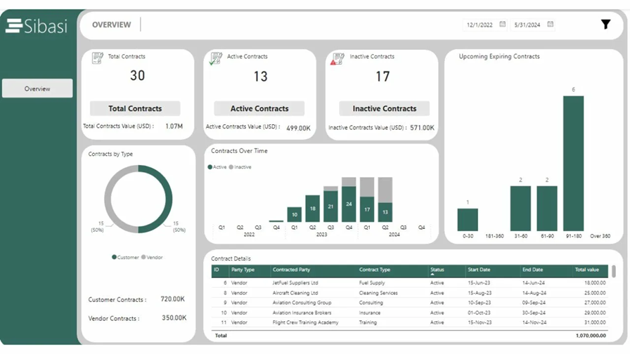
For our Contracts Dashboard, we discovered these critical questions: Are we maintaining healthy renewal rates? What's our exposure to expiring contracts? How is contract value distributed? The dashboard header immediately provides answers: 30 total contracts, 13 active, 17 inactive.
2. Design for scanning, not reading
The 5-Second Rule
Research shows executives spend 5-7 seconds on a dashboard before deciding if it's useful. Your design must support rapid information absorption.
The F-Pattern Layout
Eye-tracking studies reveal users scan in an F-pattern:
- Horizontal movement across the top
- Horizontal movement down the left side
- Quick vertical scan down the middle
Our Contracts Dashboard uses size, color intensity, and positioning to guide the eye. Large numbers (30, 13, 17) immediately draw attention, while supporting details appear in smaller text below.
3. Master the art of kpi Design
The Five Essential Elements
Every effective KPI card contains:
- Icon: Visual identifier
- Primary Metric: Large, bold number
- Context Label: Clear descriptor
- Supporting Detail: Additional context
- Color Coding: Semantic meaning
Key Insight: Context is king. A number alone is meaningless. Is 13 active contracts good? The dashboard shows it's 43% of total now we can evaluate performance.
4. Choose the Right Visualization for Your Data Story
Power BI offers 30+ visualization types, but 90% of effective dashboards use just 5-7 core types. The key isn't variety it's precision.
Strategic Chart Selection
Donut Chart: Perfect for part-to-whole relationships. The 50/50 split between Customer and Vendor contracts is immediately apparent.
Stacked Column Chart: Shows both trend and composition simultaneously. We can see that Q1 2024 had peak activity with the active/inactive split over time.
Bar Chart: Easy horizontal comparison. The dashboard reveals 6 contracts expire in the 91-180 day window crucial for renewal planning.
Visualization Selection Framework
Trends over time: Line or Column Chart
Part-to-whole: Donut or Pie Chart
Comparison across categories: Bar or Column Chart
Distribution: Histogram
Correlation: Scatter Plot
5. Implement Intelligent Color Strategy
Color in dashboards isn't about making things pretty it's about encoding meaning. Every color choice should serve a purpose: status indication, data categorization, or emphasis.
The Four Cardinal Rules
1. Accessibility First: Ensure a 4:5:1 contrast ratio minimum. Never rely on color alone pair it with icons, patterns, or labels.
2. Consistency Across Pages: If 'Active' is teal on page 1, it must be teal everywhere.
3. Limit Your Palette: Use 3-5 colors maximum. Our Contracts Dashboard uses just 3 colors total.
4. Brand Consistency: Your dashboard should reflect your organization's visual identity.
6. Design Tables for Speed and Clarity
Despite the visual focus of dashboards, tables remain essential for lookup operations, detailed transactions, and validation. The key is making tables efficient rather than exhaustive.
Strategic Column Selection
Every column must earn its place. Our Contract Details table includes only: ID, Party Type, Contracted Party, Contract Type, Status, Start/End Dates, and Total Value. Unnecessary details are available via tooltips or drill-through.
Enhancement Techniques
- Conditional Formatting: Use data bars and color scales to make patterns visible
- Smart Sorting: Default to most common business logic (highest value, most recent)
- Appropriate Precision: Financial values to 2 decimals, no decimals for counts
- Action-Oriented: Include hyperlinks and drill-through actions
7. Design for Interactivity and Exploration
The Three Levels of Dashboard Maturity
Level 1 - Passive Consumption: Static report, no interaction needed
Level 2 - Guided Filtering: Pre-configured slicers for common analysis paths (TARGET FOR MOST DASHBOARDS)
Level 3 - Active Exploration: Full drill-through and custom filtering for power users
Core Interaction Principles
- Obvious, Not Clever: Users shouldn't guess what's clickable
- Reversible: Always provide a clear way to reset filters
- Immediate Feedback: Interactions should feel instant
- Mobile-Friendly: Touch targets minimum 44×44 pixels
8. Optimize Performance for Real-World Usage
Critical Fact: If your dashboard takes more than 3 seconds to load, users will abandon it. A dashboard that looks beautiful with 100 sample rows can become unusable with 100,000 production records.
Common Performance Killers
- Unbounded Visuals: Tables showing all rows without limits
- Complex DAX: Calculations at query time instead of model time
- Poor Data Model: Missing relationships, wrong cardinality
- Inefficient M Code: Slow transformations in Power Query
Sibasi's Optimization Checklist
- Star schema with fact and dimension tables
- Use variables in DAX to avoid recalculation
- Limit visuals per page (8-12 maximum)
- Implement Top N filtering
- Test with realistic data volumes before deployment
9. Build in Governance and Data Quality Indicators
Trust is Everything: A beautiful dashboard showing incorrect data is worse than no dashboard at all.
Essential Quality Indicators
- Last Refresh Time: When was this data updated?
- Data Source Attribution: Where does this data come from?
- Known Limitations: What's excluded? What are the assumptions?
- Calculation Definitions: How are complex metrics calculated?
Row-Level Security
For sensitive data like contracts, implement RLS so users only see data relevant to their role. A vendor manager shouldn't see customer contracts and vice versa.
10. Design for Mobile and Accessibility
The Mobile Reality: 67% of executives access dashboards on mobile devices during commutes or travel. If your dashboard doesn't work on mobile, you're losing your highest-value users.
Mobile-First Design Principles
- Vertical Scrolling: Mobile layouts should stack vertically
- Touch-Friendly Targets: Minimum 44×44 pixels for interactive elements
- Simplified Visuals: Fewer data points, larger fonts
- Priority-Based Layout: Most critical info at top
- Test on Real Devices: Emulators don't capture the real experience
Accessibility Essentials
- Color Contrast: 4.5:1 minimum ratio for text
- Alt Text: Describe each visual for screen readers
- Keyboard Navigation: All elements are accessible via keyboard
- Font Size: Minimum 12pt, preferably 14pt
- No Color-Only Information: Use icons, patterns, or labels alongside color
The Sibasi Difference: From Data to Decisions
Building exceptional Power BI dashboards requires more than technical expertise, it demands a deep understanding of business processes, user behavior, and organizational context.
At Sibasi Ltd, we don't just build dashboards. We build decision-making engines.
Our Proven Four-Phase Approach
Phase 1: Discovery & Strategy
We conduct structured workshops to uncover critical business decisions, information gaps, user roles, and success metrics.
Phase 2: Design Excellence
Apply design thinking principles with information architecture optimized for your workflow and mobile-first responsive layouts.
Phase 3: Technical Excellence
Engineer for production with optimized data models, efficient DAX formulas, and comprehensive testing across devices.
Phase 4: Enablement & Support
Ensure sustained success through training, documentation, and ongoing support options.
Real Results: What Our Clients Achieve
Contracts Management Dashboard Impact
Organizations implementing our solution report:
- 63% reduction in missed renewal deadlines
- 40% faster contract value analysis
- Early warning system for contract renewals
Conclusion: Dashboard Design is Business Strategy
The best dashboards don't just display data , they shape how organizations think about their business. By surfacing contract expiry timelines, our dashboard transforms contract management from reactive to proactive.
As you build your next Power BI dashboard, remember: your goal isn't to show all the data you have. It's to answer the questions that matter, in a way that drives action.
Ready to Turn Your Data into a Competitive Advantage?
At Sibasi Ltd, we specialize in building dashboards that don't just look good they drive measurable business outcomes. Whether you're managing contracts, tracking HR performance, monitoring financials, or optimizing operations, we bring the expertise to translate your data into decisions.
The results speak for themselves. Our clients consistently report faster decisions, fewer costly oversights, and analytics that their teams actually use.
Let's Build Something Powerful Together
If you're ready to stop guessing and start deciding with confidence, we'd love to hear from you.
Call us: +254-780-742274
General inquiries: [email protected]
Visit our website: www.sibasi.com
Your data has a story to tell. Let's make sure the right people hear it.